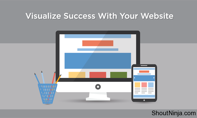
The recipe for high conversion is simple as pie: the balance between the design and content. These two components are inextricably interlinked. Once you save on the design – no one pays attention to the content. But how web design affects the conversion and is it that hard to find the golden mean when balancing the visual and the text part website? Read my advice to get the answer.
Location of a Text
According to statistics, most of the visitors look only at the top of a web page, that is, above the so-called “fold line.” The term came from the printing industry. Even if you haven’t bought printing press for a long time, you should remember that in a storefront, newspapers are always in the folded state. Therefore, put the “profitable” content at the “visible” top of the page.
Also, I recommend you to include a form for mailing to the “first screen” and use a header to attract more attention.
- Your landing page is a face of the company. If the first impression was worse than expected, you’re unlikely to get the second chance. So make the “face” of your brand clear and understandable to anyone.
On average, a landing page has about 8 seconds to attract the attention of a potential customer. Use this time to increase conversion: be fairly persistent and convincing as much as possible.
Keep the Reasonable Information on the Web Page
A laconic website in minimalist design is what you should strive for. The more space is at the web page designer to increase conversion, the better: a visitor can easily perceive all the information and make a target action. Don’t irritate visitors, and they will stay on the website longer.

Layout of web pages
Website Navigation
The navigation menu of a website should attract attention and allow the visitor to navigate easily. Therefore, better don’t experiment:
- When clicking on a logo – see beautiful logos at DesignContest – a visitor must get to the main page.
- The menu has to be horizontal and placed on the top. If it is vertical, then on both left and right sides.
Moving away from the canons of navigation, you risk confusing the customer.
Font Affects Conversion
Pick a font and its size in accordance with the content objectives. Put the most important information in the title or, at least, present it in large size. The trick for getting new customers is that they must understand the basic information on your proposal when visiting the website for the first time.
Color and Brand Awareness
A well-chosen color scheme controls buyer’s emotions and affects the awareness of the brand by building an associative connection which identifies the brand (for example, a large truck in multicolored lights may cause association with Coca-Cola).
Brand recognition and awareness are the things perceived subconsciously and remaining in the mind of a customer forever (for a long time, at least).
Color and brand awareness
Visual Cues
Place online visual cues. Large images, bold fonts, and headers help the user to find relevant information.
Photos and Graphics
Images of children, cats animals, and attractive women increase conversion, so you can safely use them. Just do not overdo. By the way, do not use stock images. If the user knows that these images have been used somewhere, your will loses the uniqueness in his eyes.
Use the features of web browsing: direct the visitor’s view from the images to the important elements of the page. Lead forms, CTAs, arrows, and lines are the best instrument to catch the user’s attention.
The Design of Buttons
There’s no any secret in the design of buttons: color and text are the two main conversion catalysts. A CTA button should stand out from the page design, but be part of it. For example, if your landing page is in pastel colors, then the CTA button must be blood-red or acid green.
Mobile Friendliness
Did you know that up to the date 60% of the sites are visited from mobile devices? A website should not only be beautiful and clear – it should also be convenient for all users. Adapt your website to mobile users and the result will be pleasantly surprised.
Simplicity
The simpler the design – the better:
- Minimum information to fill out a lead form
- Clear and simple links.
- Familiar methods of payment.
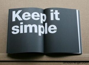
Simplicity in web design
Feedback
Popular products and statistics of sales increase interest and loyalty. Remind visitors that the proposition is safe and profitable. Provide 100% money back in case a user is not satisfied with your services. Let regular customers leave positive feedback.
Make a one-time buyer your regular customer. Offer discounts and rewards, submit notifications about products similar to which have already been ordered.
This post was originally published on StartupYar blog